


Disclaimer - All concepts in this project were for academic purposes only, not affiliated with or endorsed by Nike.
NIKE SNKRS APP REDESIGN
Nike is the world's largest athletic apparel company, they’re best known for footwear, apparel, and equipment. Founded in 1964 as Blue Ribbon Sports, the company became Nike in 1971 after the Greek goddess of victory. They are one of the most valuable brands among sports businesses, Nike employs over 76,000 people worldwide. Nike is a global company but sells the most products in the United States. Their primary competition is Adidas followed by Asics, Puma, Under Armour, Fila, New Balance, and Sketchers. In 2021, they made 44.5 billion in worldwide sales.
Project Overview
CHALLENGE
We were challenged to conduct primary & secondary research for the Nike’s SNKRS app within their 'Community' section by developing new features within their 'Discovery Page.' How might we impactfully increase user experience through the SNKRS community function to improve brand loyalty and drive sales?
GOAL
Our overarching research goals are to understand who our target market is, what motivates them to buy sneakers, and how they would like to interact with the sneaker community. Based on our findings, we will identify which key features need to be implemented to align with consumer's needs, enhance their user experience, improve brand loyalty & drive sales.
SOLUTION
01.
Design a feature that allows SNKR app users to connect with one another & create a community
02.
Primary goal for this feature is to allow customers to discuss & share their love for Nike sneakers
03.
Allow users to interact with their community in multiple ways & create strong visuals that align within existing app
CLIENT
Nike SNKRS App Redesign
ROLE
UI Designer, UX Researcher
TEAM
Copywriter - Katherine Diaz
UX Research - Kali Pappas
Additional UI Designer - Irene Dich
Project Manager - Laura Dalager
Prototype Design Lead - Jovan Sotelo
TIME
3 weeks
TOOLS
Illustrator, Photoshop, Figma, Procreate
Design Process

Pages to be Redesigned:
HOMEPAGE CATEGORIES
01.
SOCIAL
Allow users to view posts from other users on the platform
02.
PROFILE ICON
Will be redesigned to allow user personalization
03.
FEATURED
Will contain featured products that lead directly to Nike's website to purchase
04.
NIKE FORUM
Live discussion forum where users can engage with one another on various posts threads
05.
FIT CHECK
Photos & videos of products the individual user owns + include hashtag 'FitCheck' to display publicly
06.
TRENDING NOW
Will contain relevant article links to Nike products that are currently trending

PROFILE PAGE
01.
MENU ICON
Consists of the users profile settings & controls that they are able to access
02.
PROFILE BANNER
Display username, followers, following & links users to other social platforms
03.
FIT CHECK
Will display all photos & videos of outfits & fits that the user posts
04.
UPCOMING DROPS
Display drops the user has saved. Can be seen by the community & used as a way to express personal style
05.
MY COLLECTION
Displays the user's personal collection of Nike products & allows them to make notes to verity different shoe styles
06.
QR CODE
Used to verify the legitimacy of Nike products. User can also verify this in posts. Once verified, posts will receive a Nike swoosh with a 'verified' label
Research
To ensure a comprehensive understanding of our competition and target audience, we conducted primary & secondary research for the additional features we designed for the Nike Snkrs app. Our secondary research included a thorough analysis of demographic, branding, marketing, economic, and SWOT data of Nike's main competitors. This helped shape our problem statement and drive the development of user-friendly features. For our primary research, we conducted interviews, created personas, and mapped out current user journeys. We distributed questionnaires on sneaker community forums, delved into social forums for brand perception + shopping experiences, and examined the community's online presence for pain points. By incorporating insights from both secondary and primary research into personas and journey maps, we ensured a user-centric approach to effectively meet our users' needs.
Competitive Analysis
Following our comprehensive market research, we delved into analyzing Nike's competitors to gain insights into their strengths and weaknesses. We developed brand & app analysis's that provided us with a better understanding of the various strategies employed by these brands to tackle similar challenges. By leveraging this information, we made informed decisions to create the best possible product for Nike.


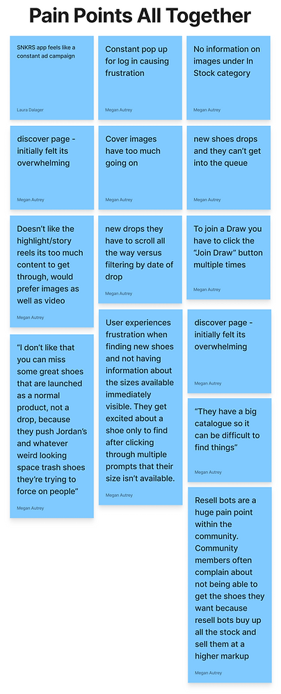
User Testing Affinity Map
In our testing, we identified patterns of user's frustrations with certain aspects of the SNKRS app. These included icons with too many options for errors, confusion with social posts and likes, lack of detail and clarity within the Nike Forum Tab, and lack of consistency within the Profile Page and My Collection section. Users also provided feedback on the My Watchlist section, suggesting the need for specific color and size preferences, clearer icons and labels throughout the app. These findings will inform our redesign efforts to improve user experience and address these usability issues.


Personas
Based on the valuable insights obtained from our secondary research, we meticulously crafted three distinct personas that embody the characteristics of potential users for our platform. These personas serve as a crucial foundation for defining the criteria for our interview participants, and will be further substantiated through the validation process of user interviews


User Flows / Site Map
To gain a comprehensive understanding of how users would navigate and complete essential tasks on the SNKRS App, we initiated the process by creating user flows both before and after conducting user interviews. These sitemaps enabled us to identify the critical steps that users would go through and the screens they would interact with during their journey on the app.


Task Flows
Having gained insights into people's expectations for information organization, we delved into further research by analyzing the navigation trends on competitors' apps. Synthesizing this information, we crafted a comprehensive site map that outlines the optimal organization of all the content on the SNKRS app and visually represents the relationships between different pages.


Low Fidelity Wireframes
To create an optimal layout for Nike's app, I began sketching various ideas that took into consideration the needs of our target persona, as well as current common design patterns.
.png)
.png)
.png)
.png)
.png)
.png)
.png)
Mid Fidelity Wireframes
Once we determined the most suitable layout for meeting our users' objectives and requirements, we proceeded to develop mid fidelity wireframes to better establish the apps structure. Additionally, we crafted responsive versions to ensure seamless layout display on various devices.


Style Guide


High Fidelity Mockups
After defining Nike's new features & the branding, we designed the visual appearance of the apps screens. Using Figma, we created a limited-functionality prototype for usability testing to observe user interaction and identify areas for improvement.


Next Steps
Throughout this project, I gained valuable insights into the importance of research and testing in developing a feature that not only caters to users' perceived needs but also addresses their actual requirements. To further advance this project, my next steps would be:
01. RE-TEST THE CHANGES
While I implemented design modifications based on the insights derived from the affinity map, I would want to seek further validation of the effectiveness of these improvements with the user as well as enhancing the overall design.
02. DESIGN HANDOFF
Once the final version of the design is ready, I would hand-off the project to the developers or other stakeholders to initiate the product development phase.
03. PRODUCT LAUNCH
Ultimately, following the development of new features, we would initiate the launch of the final product, which encompasses the new branding of the Nike SNKRS app and its updated online community experience.