VINE MADE
Brand Identity for Vine Made, a California-based natural wine company. They value connecting people & sparking meaningful conversations.
Click glasses with Vine Made
BRAND IDENTITY - LOGO DESIGN - SOCIAL MEDIA - LANDING PAGE DESIGN
Over the course of a month, my role for this project was to establish a unique brand identity for Vine Made that would resonate with their target audience & set them apart from other natural wine competitors. After researching the natural wine industry, I discovered that the market was saturated with wine brands using similar design elements. I started by developing a logo, versatile color palette & typography that represents Vine Made's ethos incorporating an earthy + organic hand drawn feel. Using the established brand guidelines, I designed packaging as well as digital assets including a desktop landing page & 6 Instagram posts + 3 stories showcasing the brands personality.
CLIENT
Concept Project
ROLE
Individual Design
LOCATION
Santa Ynez, CA
YEAR
2022


Logo
These are the primary, secondary & submark logos. They represent the vintage & comforting spirit of the brand through the stacked imperfect lettering. The hand-drawn elements communicate a sense of human connection, playfulness & are not meant to be uniform.
Logo Sizing


Color Palette
A mix of vibrant & rich primary & secondary color combinations including Emerald Green, Royal Blue & Smokey Maroon that create feelings of trust & comfortability. These bold colors pair nicely with soft tones of creams & blacks to highlight important brand messaging as well as making type stand out.

Typography


Social Media Posts
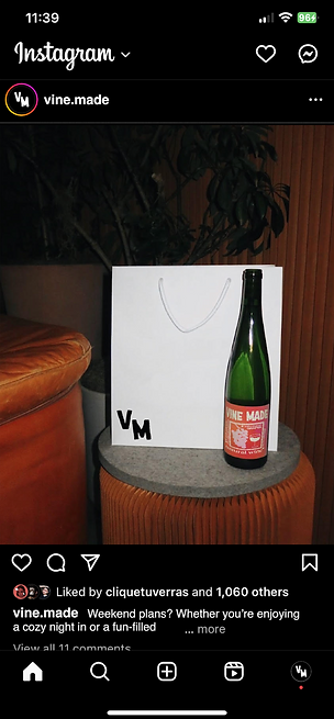
Layout of Instagram social grid templates for in-feed posts, stories & reels. The art direction strikes a balance between vintage elements & the film noir genre. The overall goal of the social deliverables are meant to evoke feelings of comfort while showcasing the lifestyle elements of the brand.


Instagram Posts


Instagram Stories + Reels


Labels
These bottle label designs play an important role in expanding Vine Made's visual language. Paper & ink textures add a vintage & tactile feel that make the visuals feel more comforting & personal.


Landing Page
The desktop landing page reflects the tone of the brand encompassing organic typographic layouts, rich vintage textures to enhance the vintage feel & hand-drawn graphics to create a balance between editorial copy & imagery.


